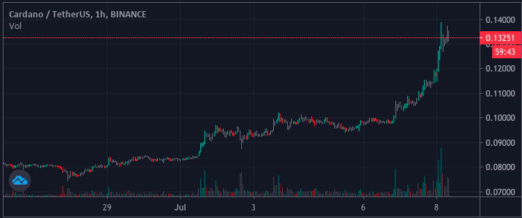
08 Jul
Different chart types
Knowing the differences and types of different charts can influence your trading. There are no superior chats – every trader must choose the one that will fit them the most and bring the biggest advantage. In this article we will discuss the most important chart types and how to use them.
Before we dive into different types of charts- there is something worth mentioning. According to some historical resources the Japanese traders began using technical analysis and early versions of candlesticks to trade rice as early as 17th century! Kudos to legendary rice trader Homma – due to his work we know candlestick charts the way they are today. Of course charts and technical analysis strategies completely differ from what they looked like in the Homma times (around mid 18th century the charts appeared as we know them today)
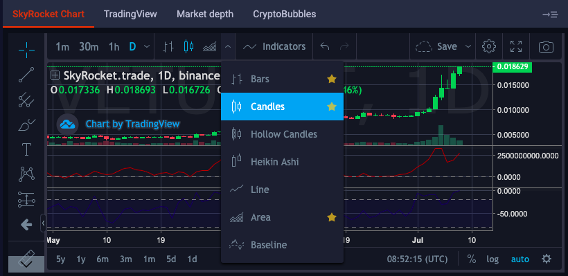
Candlesticks
They are one of the most popular of type of charts. To draw a candlestick chart you need most of all data of the opening price, highest price, lowest price and closing price of the time period. As with other charts you can choose the time frame which can vary from 1 min to even one month. The green or red part of the „box” is called body and the thin lines are called shadows tails.
The highest trade during the given time period is the top of the tail. Accordingly the lowest price is the one on end of the bottom shadow.
Bullish or Bearish?
To be a successful trader in any market you have to identify the trends. In case of candlesticks it’s easy – the colors (Red – bearish, Green – bullish) indicate if the price of the opening is lower than the price of closing.
To put candles it in the different perspective – we can say they are aways born neutral but is its due to traders how it will end up at being the end. When the candle is „born” the fight between traders begin. Depending if the sellers or buyers win the candle becomes bullish or bearish.
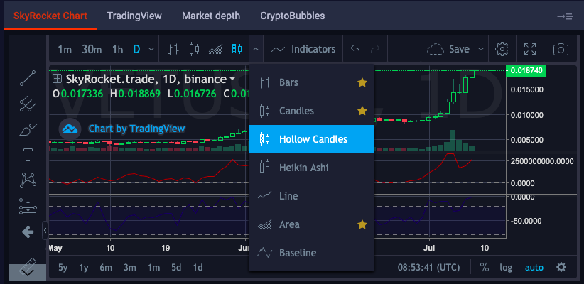
Hollow Candle
Hollow Candle can be a useful extension of the typical candlesticks as it shows additional information. First of all if the price of of opening and closing is the same the candle will appear grey.
The hollowness of the candle is based on price action within the time frame. When the candle is hollow, it means that the close was higher than the open (upward price action). If the candle is filled it means that the close was lower than open.
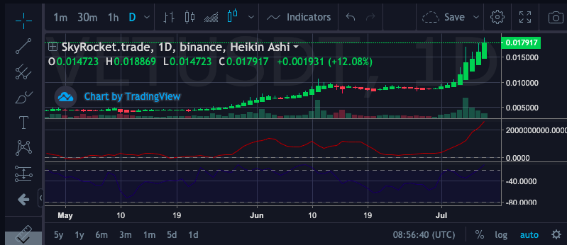
Heiken Ashi candle
Heiken Ashi candles are more complicated to explain at least in the in terms of arithmetics. Anyway many traders find them more „smooth” than usual candlestick as its takes out a lot of noise from the trading so it’s easier to see the trend (as it uses also informations from the past)
In the terms of visual appearance Heiken Ashi candle looks almost the same as „classic” candlestick. The arithmetic formula uses in the calculations:
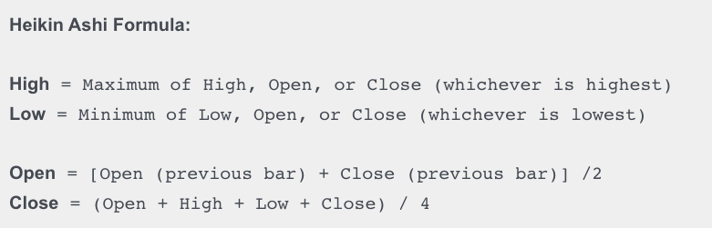
In the Open formula we can see the connection of the new candle with previous one. Because of the different approach to the Open value calculation the new candle always stays in the middle of a previous one.
Bar chart
Bar chart are still pretty popular choice. If we look at this chart, let’s say in a day bar each day will be represented by a line that represents the daily low and high. As with candlestick chart on a bar chart you can observe the time frame closing (right) and opening (left).